
12 Instagram Stories Ads Examples to Adapt for Your Brand
See the creative. Understand the decision. Make it your own. Eight vertical image references, four motion and sequence archives, and three original layout studies.
Useful Instagram Stories ads examples give you more than a screenshot: they show what catches the eye, how the message is organized, and what you could change for your own product. Here are eight vertical brand creatives and four archived Instagram motion or sequence references, followed by three original layout studies.
The image references were collected from Meta Ad Library on September 30, 2026. Their platform fields were not captured, so Stories delivery is unconfirmed. The four video archives were uploaded in 2021 and show the Feed interface; they are included for ideas you can adapt to Stories, not presented as current Stories campaigns. None of the examples comes with verified campaign performance.
Eight static creative references for Instagram Stories
Each image is shown intact. Select it to inspect the source-sized version; the adjacent notes explain the creative decisions. For the difference between an image asset and an ad format, see our guide to static ads.
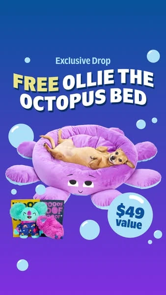
1. BarkBox: An offer you can see
- First look
- The oversized gift headline and bright octopus bed make the incentive visible before the smaller subscription details. The dog supplies scale: this is a physical gift, not just a discount code.
- How the message works
- The benefit and the object reinforce each other. The large type names the reward while the photograph shows what receiving it would look like.
- What to adapt
- Borrow the gift-first hierarchy when the bonus is part of a real offer. Keep qualification terms close enough to read; do not let the bonus hide what the customer is actually buying.
For your version, photograph the main product and bonus together. Test a gift-led message against the same offer led by the main product, with identical conditions and destination.
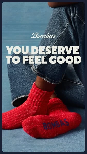
2. Bombas: A benefit shown in use
- First look
- A close crop of red socks against blue clothing creates a clear visual contrast. The person is present through the product in use rather than a face competing for attention.
- How the message works
- The short headline connects the socks to a feeling. Texture and worn fit supply the visual explanation; a dense feature list would change the job of this creative.
- What to adapt
- Keep the contrast and close crop, but choose a feeling your own product can credibly support. Use your actual photography and avoid copying another brand’s emotional promise.
This structure suits products whose fit, texture or everyday use matters. Compare a worn-product crop with a packshot while keeping the message and offer unchanged.
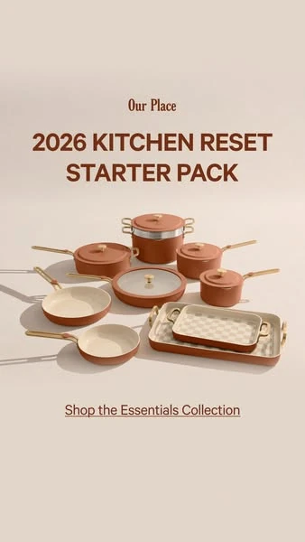
3. Our Place: A bundle with one organizing idea
- First look
- A compact group of cookware sits beneath a kitchen-reset message on a quiet background. The pieces are arranged as a set instead of competing in separate promotional boxes.
- How the message works
- The layout sells a coherent purchase occasion. The headline explains why these items belong together; the photograph communicates the range without a specification table.
- What to adapt
- Group products around a real use case, such as a starter set or a desk setup. Make the included items explicit on the destination page; props in the image must not imply extra items are included.
Use one occasion-led headline and a carefully arranged group shot. Test that occasion against a product-led headline, rather than changing the bundle and its price at the same time.
4. Huel: A useful outcome before the details
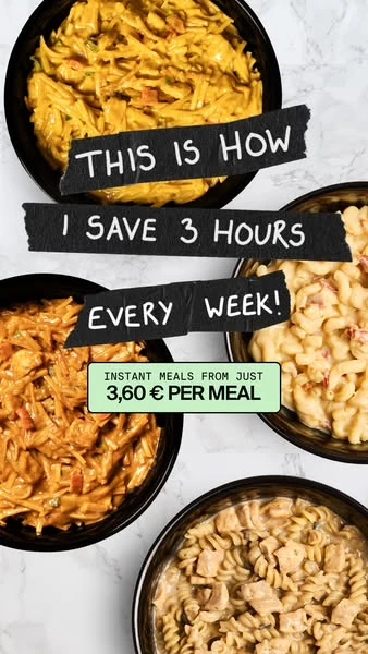
- First look
- The food occupies most of the frame, with handwritten-style text laid across it. The visual reads as an everyday meal before it reads as a product specification.
- How the message works
- The message links the meal to saved time. The photograph makes the category concrete; the time-saving statement is an advertiser claim, not a result independently verified for this guide.
- What to adapt
- Lead with a relevant task your product simplifies, then show the task or product clearly. If you quantify savings, keep the evidence and conditions behind that number.
For a meal product, show the food people actually receive. For another category, use the corresponding everyday task. Test convenience-led copy against a product-detail message without inventing a time benchmark.
5. Therabody: The product doing its job

- First look
- A person lifting the face mask connects the product to its use. A light background separates the device and face from the rest of the frame.
- How the message works
- The demonstration removes a basic uncertainty: how this object is used. It does not, by itself, prove a health benefit or tell us whether the campaign performed well.
- What to adapt
- Show a clear, representative use of your product. Keep the subject and product recognizable, and distinguish visible operation from any result that requires separate evidence.
Use an in-use photograph when a packshot leaves the function ambiguous. If motion would explain the interaction better, this is also a candidate for a short demonstration video.
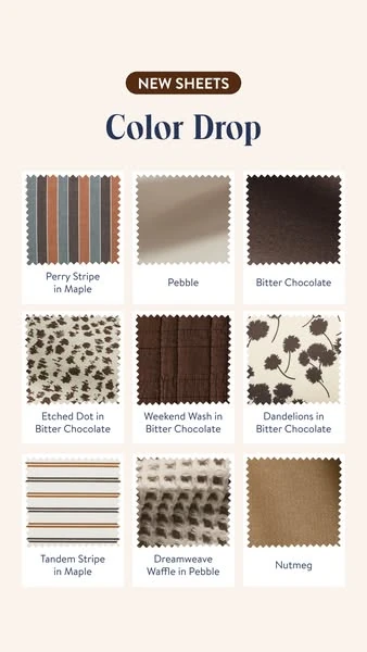
6. Brooklinen: Choice organized into a visual menu
- First look
- Color and pattern samples form a tidy grid under a short collection message. The grid lets the reader scan a range without reading a separate paragraph for every option.
- How the message works
- This is a choice-led layout. Consistent sample sizes make the differences between variants easier to compare, while the neutral background keeps the palette readable.
- What to adapt
- Use this structure when choosing a finish or color is central to the purchase. Show current, available options and make their names consistent with the product page.
For Stories, keep the number of options manageable at phone size. Compare a small selection of variants with one hero color; do not squeeze the whole catalog into a single frame.
7. Pandora: Lifestyle without losing the product
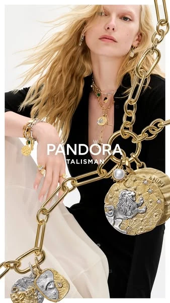
- First look
- The jewelry is worn close to the camera, with the person’s clothing and styling carrying the atmosphere. The product remains part of the focal area rather than a tiny detail in a wide scene.
- How the message works
- The image connects the product to an identity and occasion. There is little explanatory text, so the photograph has to establish both what is sold and how it feels to wear it.
- What to adapt
- Build a believable context around your product. Keep the item large enough to inspect, especially when its shape, finish or styling is the reason to buy.
If the scene could advertise almost any brand after the product is removed, bring the product closer. Test a contextual composition against a detail-led crop using the same collection.
8. Thorne: A simple product family
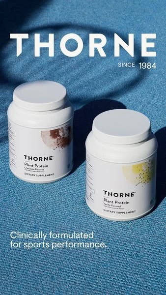
- First look
- White containers against a saturated blue background form a clear product group. The large brand word and repeated packaging create visual continuity across the range.
- How the message works
- The message relies on product-family recognition. It is a useful reference for hierarchy, but the scientific-performance statement in the image remains an advertiser claim.
- What to adapt
- Use consistent scale, spacing and light to connect products visually. Only carry over the arrangement; replace the brand, packaging and any claims with your own substantiated material.
When a range is the message, avoid making every item the same visual priority as the headline. Compare a small family of products with one featured product to learn which makes the offer easier to understand.
Four motion and sequence references to adapt to Stories
These public archives show actual motion or a recorded sequence. They are useful for planning how information unfolds, but the visible Feed interface must be replaced when designing a Story. Press play to inspect the sequence; no video autoplays.
9. Eubi: Show the feature moving
- First look
- The shorts and their stretch are visible immediately. Pulling the fabric outward turns an abstract material benefit into an observable action.
- How the message works
- The same short message stays over the demonstration. The clip repeats the visual evidence instead of introducing a new argument on every cut.
- What to adapt
- For a Story version, film the action vertically and place the message clear of the interface. This archive shows a Feed recording; the phone-screen ratio is not proof of Stories delivery.
Use movement only where it explains something a still cannot. A product being opened, folded or adjusted may need one continuous action rather than several decorative transitions.
10. reMarkable: One capability per frame
- First look
- The archive opens with a side-by-side transformation of handwriting into typed text. A later panel shows annotation on a document. Each panel answers a different product question.
- How the message works
- This is a recorded carousel sequence, not evidence of a single video ad. Its useful lesson for a multi-frame Story is the separation of capabilities, not the recording’s Feed interface.
- What to adapt
- Give each Story frame one job and enough context to stand alone. Keep the product recognizable across frames, and do not put every capability into the opening screen.
Adapt the sequence as “what it does → how you use it → next step.” That is a storyboard suggestion, not a claim about the archived ad’s results or current product capabilities.
11. Intercom: Motion that leads to a message
- First look
- The blue field and small animated character establish a recognizable visual world before the central text appears. The space around the character gives the subsequent message somewhere to land.
- How the message works
- The motion supports a short software promise rather than a long interface walkthrough. The visible text does the explaining, so the visual idea can still be understood with sound off.
- What to adapt
- When you use motion, reserve a readable pause for the message. Avoid animating every word and ornament at once; movement should guide the next look.
This archived Feed video is a reference for pacing, not a Story placement certificate. For your version, use your own visual identity and a promise the current product actually fulfills.
12. Tile: A product reveal with room to breathe
- First look
- A small tracker appears against a nearly empty white field. The product and short launch line carry the frame without a person, busy setting or feature grid.
- How the message works
- The change between frames draws attention to the product’s form. The restrained layout is useful when recognizing the object is more important than explaining many features.
- What to adapt
- Build a reveal around a recognizable product shape. Keep the product visible long enough to understand it, and make the next action clearer than an ornamental ending.
A sparse layout is not automatically better. Compare it with an in-use demonstration if the object’s function is unfamiliar to your audience. This archive also shows the Feed interface.
Adapt the structure, not somebody else’s promise
A reference is a way to make a decision, not permission to reuse another brand’s copy, product, review or offer. Start with the information job: introduce a product, explain a feature, help someone choose, or present a real incentive. Then choose the photograph and hierarchy that make that job clear.
The three studies below use existing fictional-product images to demonstrate new compositions. They are editorial layout studies, not customer campaigns or evidence of an AdVariq generation result. Their open top and bottom space is a layout starting point, not a measured safe-zone specification.
 One mug. Your everyday ritual.
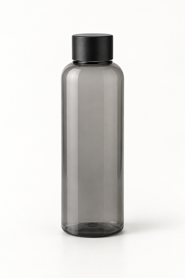 A familiar shape. A clear focal point.
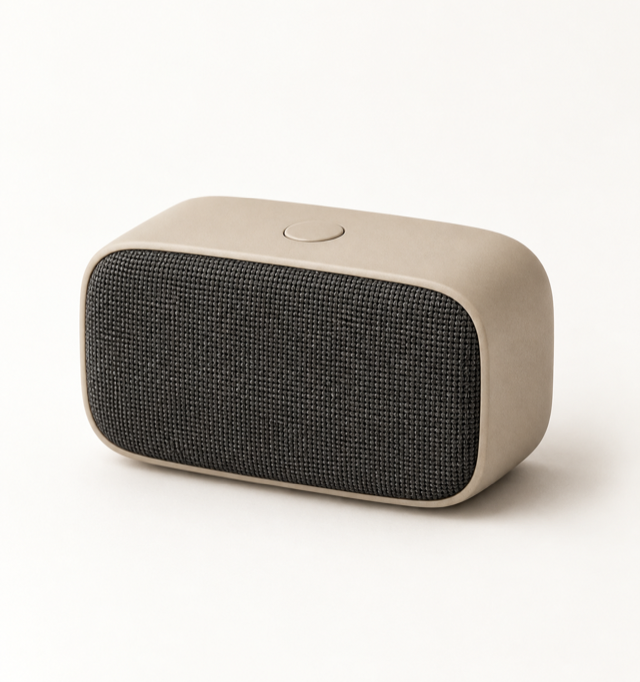 A simple idea for the workday.
A brief you can use
Product: [your actual product and source photographs]
Message: [one confirmed benefit or genuine offer]
Reference decision: [product-led crop, choice grid, demonstration or another specific structure]
Layout: A vertical composition for Instagram Stories. Make the product and message legible on a phone. Keep important elements clear of placement controls, checked in the current preview.
Keep accurate: Packaging, colors, included accessories, offer conditions and every factual claim.
Test: [one alternative message or visual decision, with a consistent offer and destination]
For a static version, prepare the product photograph and confirmed facts first. AdVariq focuses on product-photo-based scenes and static ad creative; the video references above are inspiration, not a claim that the product generates videos. You can also browse the creative library, whose fictional examples illustrate styles rather than measured results.
Check the Story placement before publishing
A vertical file is only the beginning. Use a 9:16 composition as a planning starting point, then check the current Meta image guidance for Instagram Stories and video guidance. Confirm the selected objective and placement, resolution, accepted file type, file size, duration and any delivery options in the actual upload interface. This guide does not freeze a universal pixel size or duration.
- Read it at phone size. If the supporting line needs zooming, shorten or reorganize it. Exporting more pixels does not fix a crowded message.
- Check interface coverage. Profile information and action controls can cover important content. Use the Stories preview for the actual ad rather than borrowing safe-zone numbers from an old tutorial.
- Keep sound-independent meaning. Show the key message and useful captions. Audio can add context, but it should not be the only way to understand the offer.
- Separate the design from the action. A button drawn inside an image is not itself a clickable control. Configure the actual platform CTA and verify the destination.
- Match the landing page. Product, included items, offer terms and availability should continue the same message after the click.
Feed and Reels references can teach composition or pacing, but their interface, crop and delivery options are not interchangeable with Stories. Preview each placement separately.
Find references and turn them into testable ideas
In Meta Ad Library, search an advertiser or topic, inspect the available platform and media information, and open the individual ad. Record the advertiser, Library ID, observation date, source link and the decision you want to study. If you cannot verify a field, leave it unknown rather than guessing it from a vertical image.
For this guide, we selected eight distinct vertical image structures from our September 30 collection, inspected the stored images, and checked four publicly embedded video archives on October 6, 2026. Casa Media’s Instagram examples collection provides the video archive context. Availability can change; dates describe when a reference was observed, not proof it is running today. Brand assets belong to their respective owners, and inclusion does not imply affiliation.
When testing your adaptation, write a business question: “Does a product demonstration create more qualified visits than a product-only reveal for the same offer?” Choose an outcome that fits the objective and a test design your budget can support. CTR and watch data can help diagnose attention; neither proves profitable sales. Long-running ads and multiple versions are research clues, not access to another advertiser’s CPA or ROAS.
Frequently asked questions
Can an Instagram Stories ad use a static image?
Yes. Stories creative can use images as well as video. Choose an image when the product or message is understandable in one frame; use motion when an action or sequence adds useful information. Check the current setup for the intended objective and placement.
What size should an Instagram Story ad be?
Plan a vertical 9:16 layout, then verify the current image or video requirements in Meta’s Ads Guide and upload preview. Ratio, resolution, file size and safe areas are separate checks. A square creative stretched vertically is not a properly adapted Story layout.
Are Stories ads the same as Reels ads?
They are separate placements. Both can use vertical creative, but interface controls and delivery behavior can differ. Reuse a concept where appropriate, then check text placement, crop and the action in each preview.
Which Instagram Stories ads perform best?
There is no universal winner. Product, audience, offer, message, destination and delivery conditions matter. These references explain creative decisions; they do not rank verified campaign performance. Evaluate your own business results under a suitable comparison.
Can I copy a competitor’s layout?
Study the underlying structure, then create an original version with your own assets and accurate claims. Do not copy brand identifiers, copyrighted media, testimonials or offers. A review-based layout requires an authentic review; an offer-led layout requires a real offer.
Can AI create a ready-to-publish Story ad?
AI can help explore a static layout, but publication still needs checks for product fidelity, generated text, claims, file requirements and placement coverage. Inspect the result against the source photographs, then preview it in the actual Stories placement. A good-looking image is not evidence of campaign performance.
Your next static ad starts here
Start with a product photo. Explore scenes and layouts, then choose what to test.
3 credits after email verification or Google signup. No credit card required.