
In this guide
Useful Instagram ad examples help you decide what a person should notice first: the product, a use, a choice or an offer. These eight image references show different answers, with practical checks for reading each design on a phone.
The references come from public Meta Ad Library records collected on September 30, 2026. Instagram delivery and individual Feed, Stories or Reels placements were not captured, so these are creative references to adapt, rather than verified Instagram placements. They are third-party ads, not AdVariq outputs or customer results. Offers and claims belong to the historical ads; no spend, conversion or performance data was available.
Choose a reference by the job your image needs to do
Start with the communication problem, then inspect the corresponding image. Select an image or its link to open the complete source file.
- Olipop — Make flavor recognizable
- Spindrift Sparkling Water — Show the product in an everyday moment
- Mejuri — Help someone choose a variant
- Pandora — Keep lifestyle close to the product
- cocokind — Make the interaction visible
- Liquid Death — Compare on one understandable criterion
- Allbirds — Make the purchase incentive explicit
- Thorne — Explain the recurring purchase
Eight product image ads, with an Instagram adaptation for each
1. Olipop: Make flavor recognizable
- What catches the eye
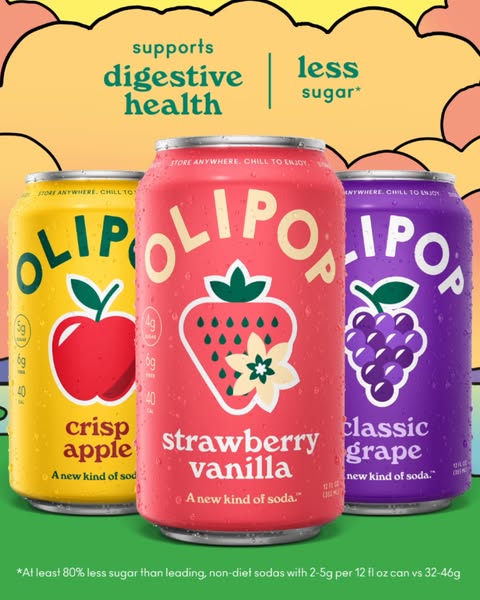
- A pink strawberry-vanilla can stands in front of yellow and purple cans. Large packaging and color do most of the work; you can identify a drink before reading the smaller statements above it.
- How the message is organized
- The overlapping cans establish one lead flavor and two alternatives. The upper text adds the advertiser’s digestive-health and sugar claims; those statements are not evidence established by the image or by this guide.
- How to adapt it
- For a range differentiated by flavor or finish, choose one lead variant and let the others frame it. Carry the same variant names and colors through to the product page. The useful structure is the hierarchy, not another brand’s health claims.
- Phone check and one test
- At phone width, check whether the lead variant is still identifiable without enlarging the image. Test one hero flavor against a small range while keeping the headline, audience and offer unchanged.
2. Spindrift Sparkling Water: Show the product in an everyday moment
- What catches the eye
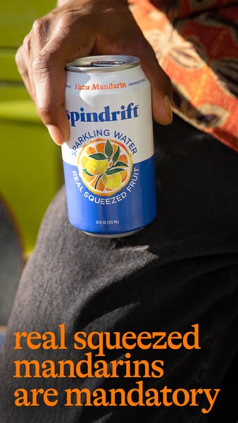
- A hand grips a single can against dark clothing and a sunlit outdoor background. The product feels close enough to recognize, while the hand supplies scale and context.
- How the message is organized
- The can label introduces the flavor; the lower orange line connects it to real squeezed mandarins. The photograph gives context without needing a wide scene. The ingredient statement remains the advertiser’s claim.
- How to adapt it
- Use a real use moment when scale, handling or occasion matters. Keep your actual product prominent and avoid props that imply unverified ingredients or accessories. Put the message in a calm part of the photograph.
- Phone check and one test
- This source is a tall image, not proof of a Stories or Reels placement. For a Feed version, recompose around the hand and can instead of cropping away the lower message. Compare this context with a plain packshot using the same proposition.
3. Mejuri: Help someone choose a variant
- What catches the eye
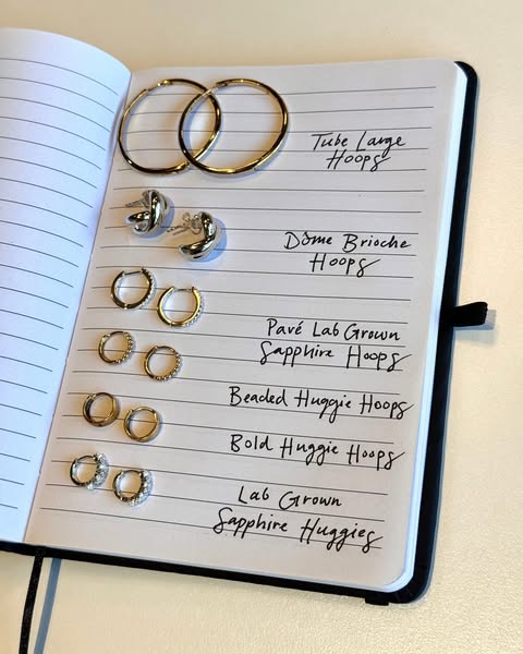
- Pairs of hoop earrings lie on notebook lines, with handwritten names alongside them. Repeated rows turn a collection into a visual menu rather than a pile of jewelry.
- How the message is organized
- The physical notebook provides a familiar sorting device. Similar presentation makes size and shape differences easier to compare. The source ad text asks which hoops the viewer would add to a stack; that question sits outside the photographed list.
- How to adapt it
- Use this approach when variant choice is a real purchase question. Photograph a manageable selection with consistent scale and label the options as they appear on your store. Avoid mixing unrelated items merely to fill rows.
- Phone check and one test
- The handwritten labels are the first detail to become small. Reduce the number of options for your own mobile layout rather than shrinking every row. Test a short selection against one featured pair with the same collection link.
4. Pandora: Keep lifestyle close to the product

- What catches the eye
- A close portrait and enlarged jewelry details share the square image. The person supplies the styling context; the prominent charms prevent the product from becoming a minor accessory in a broad lifestyle scene.
- How the message is organized
- The Pandora name and Talisman collection line tie the portrait and product details together. The image asks the photograph to establish style and identity instead of explaining a long feature list.
- How to adapt it
- For accessories or wearable products, choose a context that helps the shopper judge the item’s appearance. Keep the product recognizable at the final display size and preserve its actual proportions, finish and included pieces.
- Phone check and one test
- Check the thumbnail as well as the enlarged image: can someone tell what is being sold? Compare a close product-and-person composition with a detail-only version, using the same collection and destination.
5. cocokind: Make the interaction visible
- What catches the eye
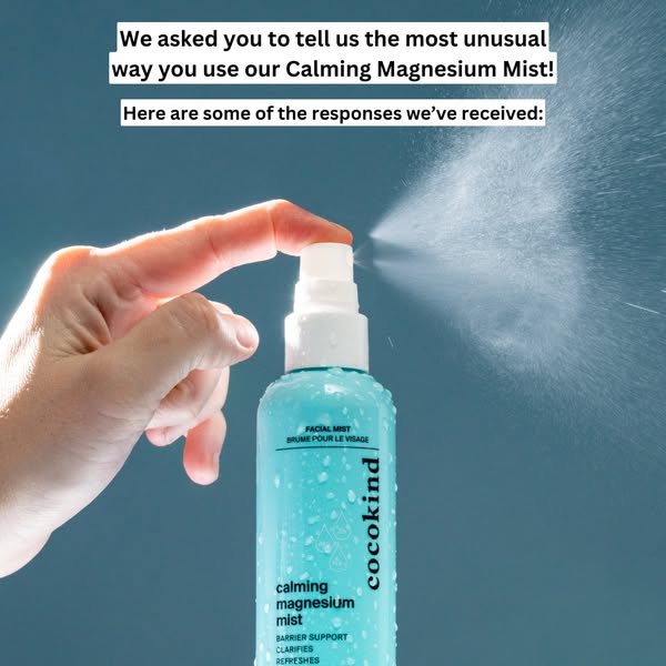
- The hand, spray nozzle and visible mist form a clear action. The blue background separates the bottle and spray, making this a demonstration contained in a single photograph.
- How the message is organized
- Text strips above the hand refer to an earlier question about unusual uses and introduce responses. The source ad text invites comments. Neither the spray photograph nor the question establishes the product’s effectiveness or validates every suggested use.
- How to adapt it
- A still demonstration is useful when a package alone leaves the product’s operation unclear. Show a representative, supported use. Write a question only if a response serves your objective; a discussion prompt and a purchase message have different jobs.
- Phone check and one test
- The text strips contain more words than the action needs. Check them at actual phone width, then consider one short line in your own version. Test a usage-led statement against a question while retaining the same photograph.
6. Liquid Death: Compare on one understandable criterion
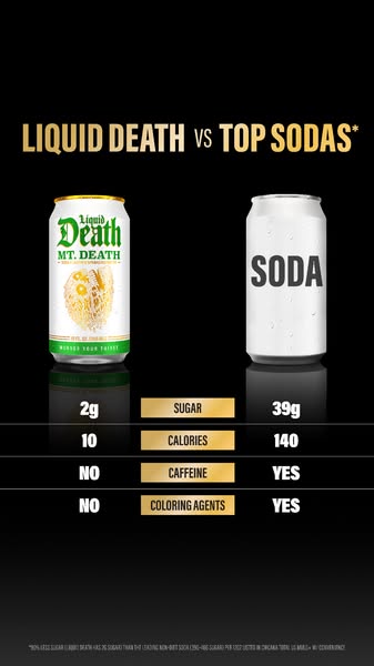
- What catches the eye
- Two cans sit on a black background above aligned comparison rows. The left/right arrangement provides an immediate reading direction before the small figures are legible.
- How the message is organized
- The artwork contrasts Liquid Death with “top sodas” on several attributes. Its numerical values, comparator and tiny qualification are advertiser claims, not independently verified conclusions. A comparison needs its definitions and conditions, not just striking numbers.
- How to adapt it
- Use a comparison only when you can substantiate both sides with a consistent basis. For your own product, prefer the one attribute that matters most to the shopper and make the comparison basis readable near the claim.
- Phone check and one test
- The footnote and table are dense at mobile size. Opening the original helps inspect the reference, but your ad’s essential qualification must be readable in the ad itself. Test a supported single-criterion comparison against a product-only message.
7. Allbirds: Make the purchase incentive explicit
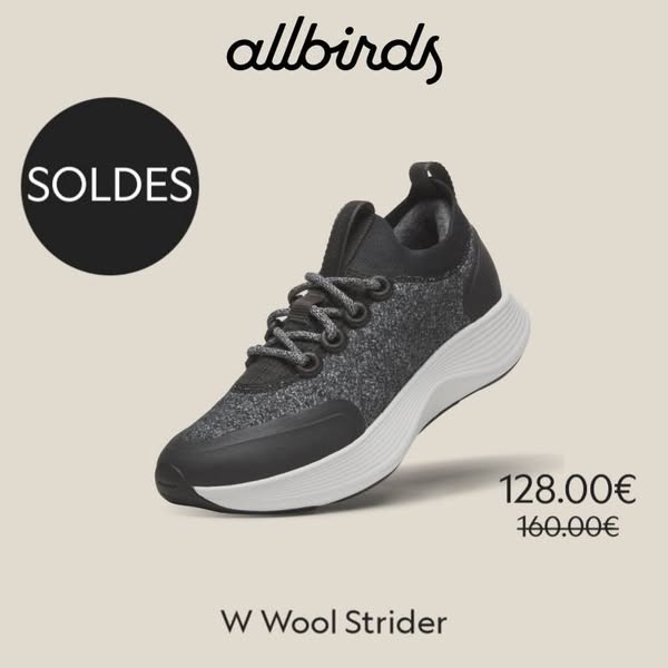
- What catches the eye
- One black shoe is large against a quiet beige background. A sale circle and two prices are separate visual anchors, so the object remains recognizable even before the offer is read.
- How the message is organized
- The brand sits above the shoe; the model name sits below it. The crossed-out and reduced prices describe the historical creative’s offer. The source ad text adds delivery information that is not printed as a headline on this image.
- How to adapt it
- For a promotion, show the exact variant covered by the offer. Keep currency, eligibility and destination consistent with your current terms. Do not inherit this reference’s historical discount, availability or delivery promises.
- Phone check and one test
- Check whether the product name and price can be read without zooming. Keep a qualification close to the offer when it changes its meaning. Test an offer-led version against the same product at the same price with a product-detail headline.
8. Thorne: Explain the recurring purchase
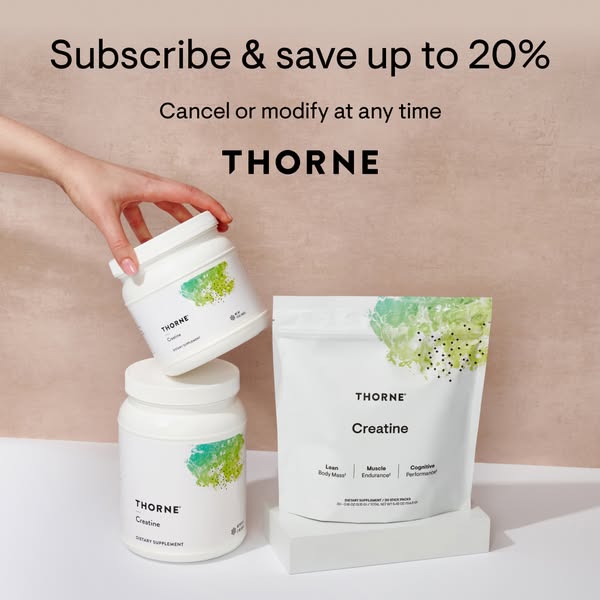
- What catches the eye
- A hand reaches for a white container above a small product group. The action makes a recurring product feel tangible; the large subscription-saving line introduces the commercial reason to look closer.
- How the message is organized
- The image pairs a savings statement with a cancellation or modification line. The source ad text also mentions shipping. These were the advertiser’s recorded terms, not a current offer verified here or a general promise about subscriptions.
- How to adapt it
- This structure suits a product that genuinely supports repeat purchase. Explain what repeats, the relevant saving and the commitment accurately. Keep subscription conditions distinct from any health or product-performance claims.
- Phone check and one test
- The flexibility line is smaller than the savings headline. Check that meaningful conditions survive your phone preview and agree with checkout. Compare subscription-led wording with a straightforward replenishment message, keeping the plan terms fixed.
An image asset is not a placement
A square or tall file describes the asset’s shape. Feed, Stories and Reels describe where an ad is delivered. A tall source image does not establish that it ran in Stories, and a still image is not a demonstration video.
For your own campaign, choose the destination placement first, then check the current Meta Instagram Feed image guide and the actual Ads Manager preview. Recompose if the product or important text is cut off; do not force every image into one crop. The reference files here are archive images, not recommended export resolutions.
For vertical composition and sequence ideas, use our separate Instagram Stories ad references. For format definitions, see what a static ad is.
Turn a reference into a brief for your product
Choose a structure because it solves a communication problem. A small range can help someone compare flavors; a hand can explain scale; a genuine offer can clarify a purchase. Copying a brand’s exact photograph, review or promise does not answer your own product question.
Write these six lines before creating the image:
- Audience and moment: Who is looking, and what decision are they making?
- One message: What should they remember after a brief glance?
- Product evidence: Which real photo and supported facts make that message credible?
- Visual structure: One hero product, context, a small range, a demonstration, a comparison or an offer?
- Placement and next step: Where will it appear, and what should the linked page let the person do?
- One variation: Which single message or composition change will you compare while other conditions stay stable?
Use your own product photos, selling points and brand assets in AdVariq to create static image variations. Review the product details, wording and final display before export. AdVariq creates image creatives; it does not publish or manage the campaign. The creation link below opens the current App flow.
Before using the image, check that the product is recognizable, key text and conditions are readable on a phone, claims have support, the destination agrees with the offer, and the intended placement preview keeps the message intact.
Common questions about Instagram image ads
What makes a good Instagram ad example?
A useful example reveals a decision you can learn from: a clear product, hierarchy, context or offer. Searches for “best Instagram ad examples” do not give us performance evidence. Choose a relevant structure and validate it with your own campaign data rather than treating this list as a ranking of winners.
Are these ads confirmed Instagram placements?
No. Their source records are from the Meta Ad Library, but the platform and placement fields were not captured. Each image has a source link and collection date so you can distinguish the archived reference from our adaptation advice.
Can I use the same image for Feed and Stories?
You can develop related versions from the same idea, but inspect each placement separately. Cropping can remove the product, title or conditions. Our Stories guide covers the vertical composition task; this guide focuses on the message inside a product image.
Can I reuse these brands’ pictures or offers?
Study the structure, then use your own assets and substantiated facts. This analysis does not grant permission to republish another brand’s creative, and the archived offers are not current purchase recommendations.
Where should I look for more examples?
Browse the public ad reference library or compare the different structures in our Facebook static ad examples. The Stories guide covers vertical and sequence references separately.
Keep reading
Your next winning creative
starts here
One product photo. Infinite creative angles. Built to convert.
3 free credits · No credit card required