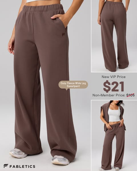
Fabletics
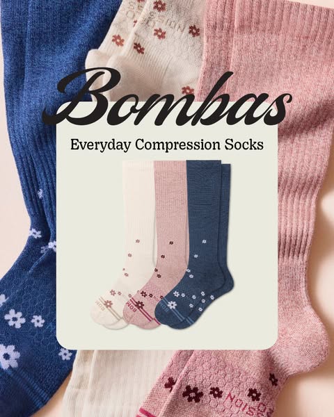
Bombas reframes compression socks from medical necessities into approachable daily wellness. A central cream card anchors the product title, framed by high-end patterned socks.
Use this verified reference as an architectural layout template for your own products in AdVariq.
Use this referenceContinue in AdVariq to supply your product photos and review your ad before generating.
Visual hierarchy, copy placement, and compositional mechanics observed in this ad.
Ideal for functional accessories, basics, or wellness apparel where elevating the aesthetic overcomes consumer embarrassment or medical stigma.
Do not copy Bombas’ bee logo embroidery, specific floral knit patterns, or proprietary compression band engineering.
Copy this structured framework into your creative brief or design checklist.
Use this ad as a reference for central card-and-textile composition.

My product: [name and category title]
Pattern assortment: [3 distinct stylish colorways or patterns]
Central card text: [Brand mark + Product descriptor]
Background arrangement: [radiating flat-lay fabric textures around the card]

Keep the central card crisp, matte, and readable with subtle drop shadow.
A flat-lay card composition lets shoppers admire the full knit pattern and color palette without distractions from model footwear or legs.
A gentle, humanized serif or soft script brand mark paired with a clean, geometric sans-serif subhead communicates both warmth and quality.
Explore comparable layout frameworks from other brands in this category.