Skip to content
AdVariq
Creative Structure

Benefit-Led Static Ad Creative Examples

A benefit-led ad leads with one singular customer outcome—such as lightweight hydration, digestive wellness, or all-day compression—and organizes supporting facts and product views around that central promise.

Curated Ad Breakdowns

Curated ad creative references with documented structures and layout hierarchies.

7 Curated References
cocokind338×600

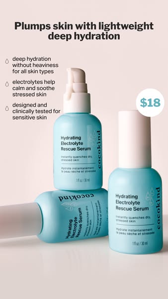
How cocokind organizes a hydration promise, benefits, and price

This vertical ad gives the reader a short path through the offer: one headline, three supporting points, a prominent product arrangement, and a separate price badge. Here is what you can borrow from the structure—and what belongs only to the original product.
Olipop480×600

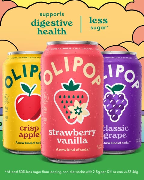
How Olipop balances appetite appeal and functional benefits in a static lineup

Olipop stages three colorful soda cans—Crisp Apple, Strawberry Vanilla, and Classic Grape—under a bold functional header declaring "supports digestive health | less sugar*".

Liquid Death338×600

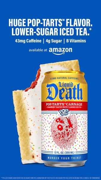
How Liquid Death pairs unexpected collaboration with concrete nutrition bullets

Liquid Death teams up with Pop-Tarts for a strawberry iced tea ad that leads with an arresting flavor collaboration, pairing the can with an actual frosted toaster pastry and backing it with three precise nutrient metrics.

Liquid Death337×600

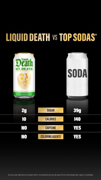
How Liquid Death uses a nutritional scorecard to unseat legacy sodas

This vertical comparison ad stages Liquid Death Mt. Death directly against a generic silver "SODA" can, laying out an indisputable 4-row scorecard contrasting sugar, calories, caffeine, and artificial coloring agents.

Bombas480×600

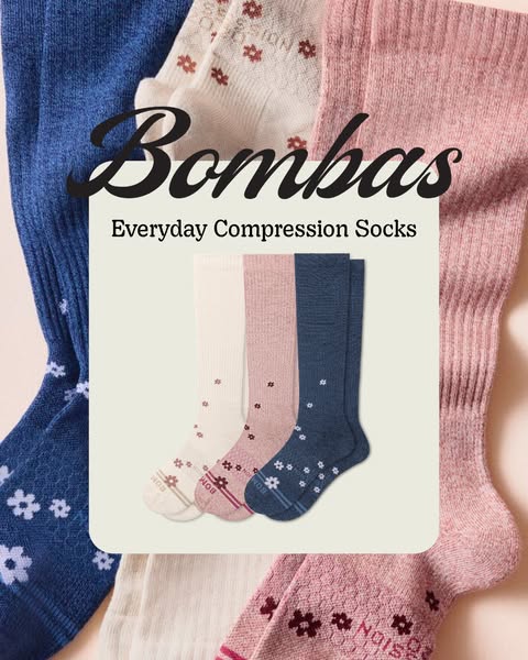
How Bombas transforms a medical garment into an everyday lifestyle staple

Bombas reframes compression socks from medical necessities into approachable daily wellness. A central cream card anchors the product title, framed by high-end patterned socks.

Fabletics480×600

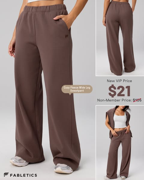
How Fabletics combines multi-angle fit proof with high-contrast VIP pricing

Fabletics proves the drape and silhouette of its Cozy Fleece Wide Leg Sweatpant across three complementary photo angles, anchoring purchase intent with a dramatic $21 VIP vs $105 non-member price contrast.

Alo Yoga1080×1350

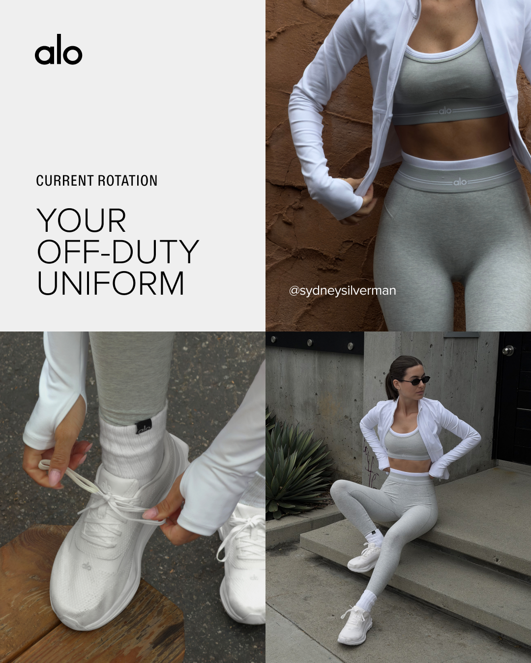
How Alo Yoga curates a 4-quadrant lifestyle lookbook for head-to-toe styling

Alo Yoga presents its "Off-Duty Uniform" using a 4:5 four-quadrant grid. The layout harmonizes editorial branding, fabric and waistband close-ups, footwear styling, and full architectural lifestyle photography.

Angle Comparisons & Selection Guidance

Evaluate how different creative structures on this page solve specific messaging challenges.

Hierarchical badge bullets vs. centered editorial value card

cocokind groups three concise droplet bullets on the left with a circular price badge, while Bombas centers a typographic title card inside a border of radiating products to elevate everyday relief.

Multi-flavor benefit banner vs. nutrition scorecard breakdown

Olipop spans its digestive health promise across three colorful cans, while Liquid Death turns its benefit into a head-to-head scorecard contrasting specific grams of sugar and calories.

Frequently Asked Questions

Practical considerations when planning ads for this creative category.

How many benefits should be featured in a single static ad?

Limit the visual hierarchy to one dominant promise in the headline and no more than three short supporting proof points to avoid overwhelming mobile viewers.

When should price be included in a benefit-led ad?

Include price when it serves as a differentiator or lowers friction for an impulse-friendly purchase (such as cocokind's $18 serum or Fabletics' $21 VIP offer). If your product is premium-priced, focus on unique formulation first.

Explore Related Creative Collections