
Skip to content
AdVariq
cocokind·Observed October 11, 2026

How cocokind organizes a hydration promise, benefits, and price

This vertical ad gives the reader a short path through the offer: one headline, three supporting points, a prominent product arrangement, and a separate price badge. Here is what you can borrow from the structure—and what belongs only to the original product.
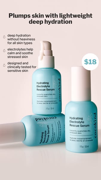
Three bottles of cocokind hydrating electrolyte rescue serum with benefit bullet points and an 18 dollar price badge
Source MaterialMeta Ad Library
Aspect Ratio
338:600
Native Dimensions
338 × 600 px
Third-party advertising reference from cocokind for layout analysis and design education.
Creative Workflow

Use this verified reference as an architectural layout template for your own products in AdVariq.

Use this reference

Continue in AdVariq to supply your product photos and review your ad before generating.

Creative Deconstruction

Visual hierarchy, copy placement, and compositional mechanics observed in this ad.

1

One headline sets the reading order

Observed element: The headline sits above the product and supporting copy, reading "Plumps skin with lightweight deep hydration".
Why it works: It introduces a single hydration promise before the reader reaches the smaller details.
How to adapt: For another product, use one benefit you can support instead of listing every feature at the top.
2

Short supporting points make the claim easier to inspect

Observed element: Three statements sit together on the left, each introduced by a small droplet symbol.
Why it works: Their job is to add concrete detail to the main promise without turning the ad into a wall of text.
How to adapt: The original ad includes product-specific claims; replace them with up to three verified facts about your own formulation.
3

Repeated packaging creates a product anchor

Observed element: Several views of the same mint serum occupy the lower part of the frame with subtle watery reflections.
Why it works: The arrangement gives the product visual weight while leaving a separate reading area for the copy.
How to adapt: A different product may need a single centered view rather than repeated bottles depending on packaging shape.
4

Price has its own place

Observed element: A white circular badge separates the $18 price from the benefit list.
Why it works: This makes the price easy to find without confusing it with formulation points.
How to adapt: If price is not central to your message, omit the badge or test a less prominent treatment.

Applicability & Boundaries

When to use this structure

Consider this structure when you have one clear promise and a few concrete facts that support it. If those facts are missing, simplify the message. Keep the original brand, price, testing statements, and product claims out of your adaptation.

What NOT to copy

Do not copy the $18 price point, the specific electrolyte testing claim, or the mint-toned graphic motifs unless verified for your own product.

Adapt this idea

Copy this structured framework into your creative brief or design checklist.

Use this ad as a reference for information hierarchy, not as a source of product claims.

My product: [name and product photo]
Main benefit: [one benefit supported by my product information]
Supporting facts: [up to three verified facts; leave empty if unavailable]
Price or offer: [optional, including relevant conditions]

Keep the headline, supporting information, and product easy to distinguish. Adapt the arrangement to my packaging and the amount of copy. Do not retain the reference brand, original price, or claims I have not supplied. Keep all text readable in the intended preview size.

Questions About This Ad

Can I omit the circular price badge in my ad?

Yes. If your product is premium-priced or price is not a primary selling hook, replace the price badge with a secondary proof pill or remove it entirely.

Is this ad optimized for Instagram Stories or feed?

At a 9:16 vertical ratio, this layout is tailored for Stories and Reels, but the content block easily adapts to a 4:5 feed format.

Categories for this creative:

Related Ad Breakdowns

Explore comparable layout frameworks from other brands in this category.
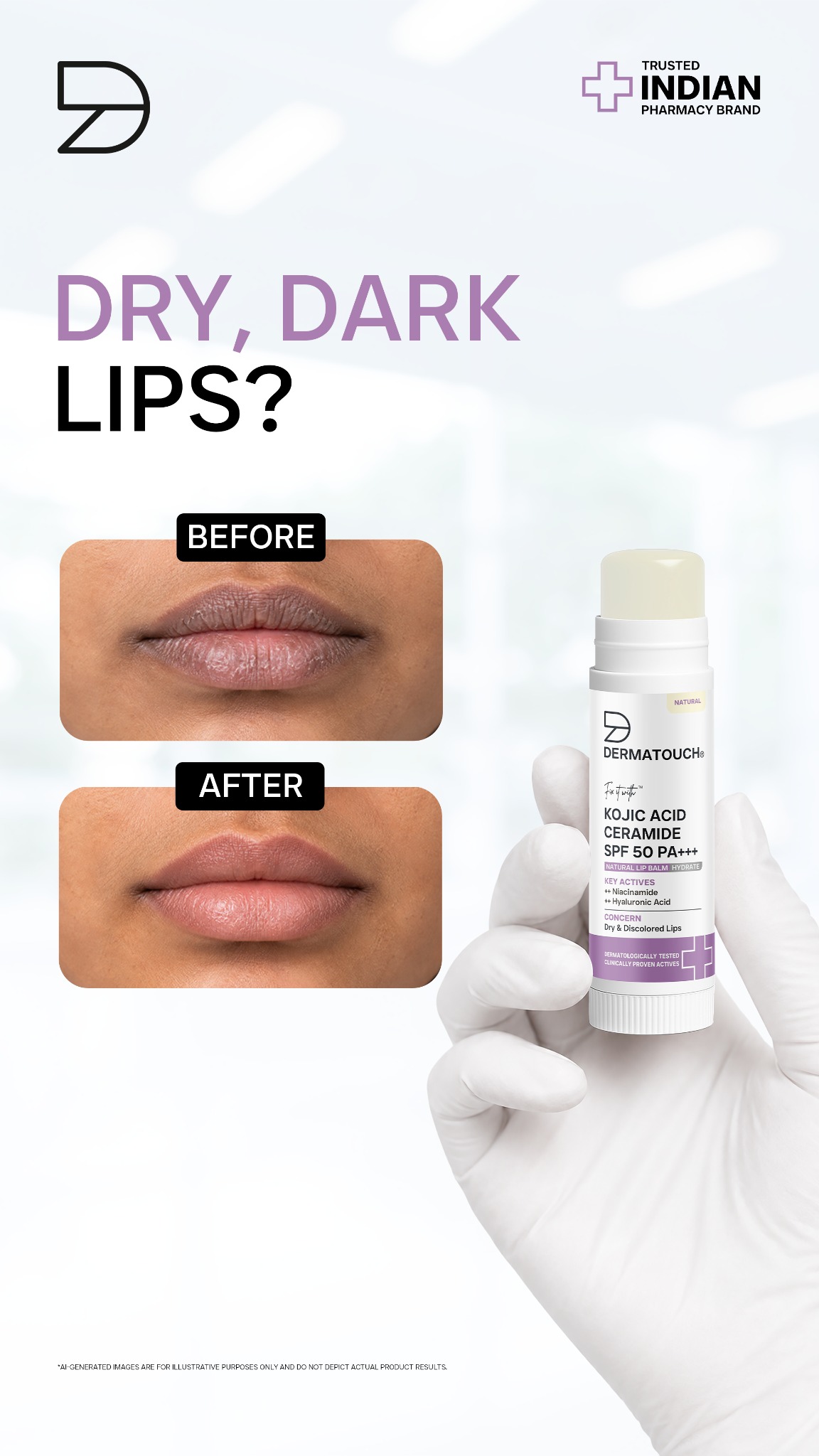
Dermatouch before and after lip care ad showing dry lip comparison and Kojic acid lip balm tube
Dermatouch

How Dermatouch structures a dual-frame before-and-after lip care ad

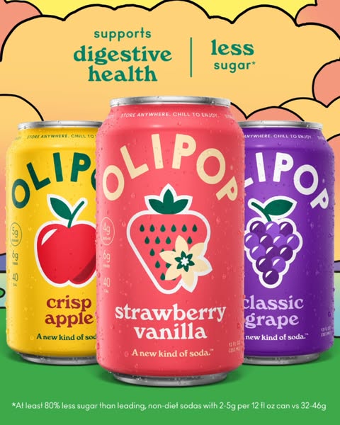
Three cans of Olipop soda arranged on pastel background with digestive health and less sugar headline
Olipop

How Olipop balances appetite appeal and functional benefits in a static lineup