
Skip to content
AdVariq
Olipop·Observed September 30, 2026

How Olipop balances appetite appeal and functional benefits in a static lineup

Olipop stages three colorful soda cans—Crisp Apple, Strawberry Vanilla, and Classic Grape—under a bold functional header declaring "supports digestive health | less sugar*".
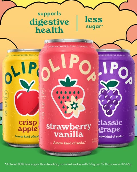
Three cans of Olipop soda arranged on pastel background with digestive health and less sugar headline
Source MaterialMeta Ad Library
Aspect Ratio
480:600
Native Dimensions
480 × 600 px
Third-party advertising reference from Olipop for layout analysis and design education.
Creative Workflow

Use this verified reference as an architectural layout template for your own products in AdVariq.

Use this reference

Continue in AdVariq to supply your product photos and review your ad before generating.

Creative Deconstruction

Visual hierarchy, copy placement, and compositional mechanics observed in this ad.

1

Dual functional promise anchors top header

Observed element: The header reads "supports digestive health | less sugar*" in bold green lowercase lettering.
Why it works: The combination of a positive addition (digestive support) with a reduction of guilt (less sugar) addresses both health desires in a single breath.
How to adapt: Lead with one functional wellness benefit paired with one clean-label nutritional metric.
2

Three-can lineup showcases variety without overwhelming choice

Observed element: Strawberry Vanilla sits center-front, flanked symmetrically by Crisp Apple and Classic Grape.
Why it works: Displaying three distinct flavor options proves flavor range while maintaining a single, uncluttered visual focus.
How to adapt: When showcasing an assortment, feature exactly three representative flavors to prevent choice fatigue.
3

Wavy retro border frames the product stage

Observed element: A pastel pink scalloped wave border wraps around the soft yellow background.
Why it works: The playful frame evokes classic soda fountain nostalgia, softening the serious clinical tone of "digestive health".
How to adapt: Use warm, nostalgic illustrative framing to keep functional food products approachable and fun.
4

Detailed footnote provides regulatory substantiation

Observed element: The bottom edge specifies: "At least 80% less sugar than leading, non-diet sodas with 2–5g per 12 fl oz can vs 32–46g".
Why it works: Backing the asterisk with exact gram comparisons substantiates the claim for discerning consumers and compliance reviewers.
How to adapt: Always specify benchmark comparison ranges in small type when making comparative sugar or calorie claims.

Applicability & Boundaries

When to use this structure

Ideal for functional beverage and snack lines with multiple flavors that want to look delicious first while clearly establishing wellness credentials.

What NOT to copy

Do not duplicate Olipop’s trademarked can art, specific flavor names, or proprietary digestive health formulations.

Adapt this idea

Copy this structured framework into your creative brief or design checklist.

Use this ad as a reference for 3-flavor assortment composition.

My product: [brand name and 3 distinct flavor cans/packs]
Primary health promise: [functional benefit e.g. gut health, clean energy, focus]
Secondary dietary claim: [e.g. less sugar, high protein, low sodium]
Flavor names: [3 clear flavor labels]
Substantiation footnote: [exact comparative metric vs conventional category standard]

Center the hero flavor slightly forward and frame with approachable warm tones.

Questions About This Ad

Why is Strawberry Vanilla placed in the center?

The bright red and pink packaging draws the eye first, serving as the central anchor while the yellow and purple cans provide balanced symmetry.

Is "supports digestive health" compliant for ad copy?

In the US, structure/function claims are permissible for dietary products when supported by substantiation and not claiming to diagnose or cure diseases.

Categories for this creative:

Related Ad Breakdowns

Explore comparable layout frameworks from other brands in this category.
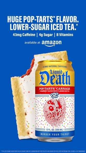
Poppi split comparison ad with Old Me on left showing blank silver can and New Me on right showing vibrant green lemon lime can
Poppi

How Poppi uses a lifestyle before-and-after contrast for healthy soda

Can of Liquid Death Pop-Tarts iced tea next to a frosted strawberry Pop-Tart with nutrient bullet points
Liquid Death

How Liquid Death pairs unexpected collaboration with concrete nutrition bullets