
Skip to content
AdVariq
Liquid Death·Observed September 30, 2026

How Liquid Death uses a nutritional scorecard to unseat legacy sodas

This vertical comparison ad stages Liquid Death Mt. Death directly against a generic silver "SODA" can, laying out an indisputable 4-row scorecard contrasting sugar, calories, caffeine, and artificial coloring agents.
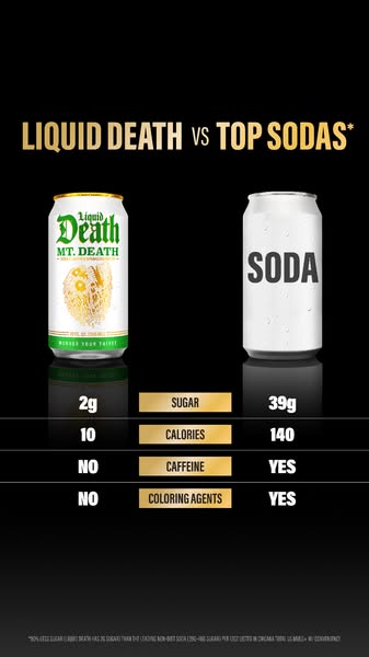
Liquid Death can side by side with generic soda can with four-row nutritional scorecard comparison
Source MaterialMeta Ad Library
Aspect Ratio
337:600
Native Dimensions
337 × 600 px
Third-party advertising reference from Liquid Death for layout analysis and design education.
Creative Workflow

Use this verified reference as an architectural layout template for your own products in AdVariq.

Use this reference

Continue in AdVariq to supply your product photos and review your ad before generating.

Creative Deconstruction

Visual hierarchy, copy placement, and compositional mechanics observed in this ad.

1

Direct head-to-head comparison headline

Observed element: The headline reads "LIQUID DEATH VS TOP SODAS*" in bold gold typography.
Why it works: Calling out the entire competitive category ("Top Sodas") immediately frames Liquid Death as a heavyweight contender rather than a niche water brand.
How to adapt: Frame your product against the legacy category leader if your nutritional metrics offer a decisive win.
2

Four-row nutrition scorecard makes facts undeniable

Observed element: The table compares: 2g vs 39g Sugar, 10 vs 140 Calories, NO vs YES Caffeine, and NO vs YES Coloring Agents.
Why it works: The stark metric contrast (2g vs 39g) delivers an instant visceral realization of how much sugar traditional soda contains.
How to adapt: Pick 3 to 4 objective nutrition panel metrics where your product holds an overwhelming numerical advantage.
3

Generic competitor labeling avoids legal infringement

Observed element: The rival can is a plain unbranded silver cylinder with simple text reading "SODA".
Why it works: Avoiding trademarked brand logos protects against legal action while still making the competitive target obvious to everyone.
How to adapt: Use generic category placeholders (e.g. "Standard Soda", "Traditional Lotion") rather than actual competitor logos.
4

High-contrast black backdrop amplifies golden typography

Observed element: The entire composition sits on matte black with gold and white data rows.
Why it works: The dark palette conveys rock-and-roll authority, elevating the ad from sterile clinical data to rebellious brand advocacy.
How to adapt: Use deep contrast backgrounds to make technical comparison tables feel bold and stylish.

Applicability & Boundaries

When to use this structure

Best when entering an established category where your formulation delivers an overwhelming, indisputable numerical victory on sugar, calories, ingredients, or cost.

What NOT to copy

Do not make up competitor nutrition statistics. All comparison points must be verifiable against standard grocery nutrition fact panels.

Adapt this idea

Copy this structured framework into your creative brief or design checklist.

Use this ad as a reference for head-to-head nutritional scorecard creative.

My product: [name and hero packshot]
Competitor placeholder: [generic category can or container]
Headline: [My Brand vs Traditional Category Standard]
Metric rows (up to 4):
- Row 1: [Key metric e.g. Sugar: 2g vs 39g]
- Row 2: [Calorie or macro metric: 10 vs 140]
- Row 3: [Unwanted ingredient: NO vs YES]
- Row 4: [Artificial additive: NO vs YES]

Maintain strict two-column table alignment beneath the side-by-side products.

Questions About This Ad

Is comparing "Liquid Death vs Top Sodas" legally permissible?

Yes, comparative claims are lawful when grounded in truthful, substantiated nutritional facts and where competitor products are represented fairly.

Why include "NO vs YES" rows in addition to numbers?

Binary YES/NO rows for artificial colorings and additives provide instant cognitive takeaways for skimmers who do not read numbers.

Categories for this creative:

Related Ad Breakdowns

Explore comparable layout frameworks from other brands in this category.
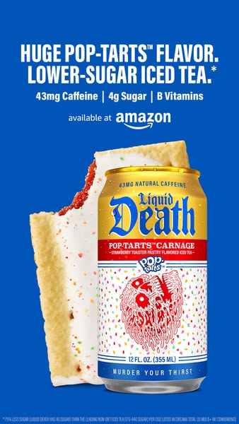
Can of Liquid Death Pop-Tarts iced tea next to a frosted strawberry Pop-Tart with nutrient bullet points
Liquid Death

How Liquid Death pairs unexpected collaboration with concrete nutrition bullets

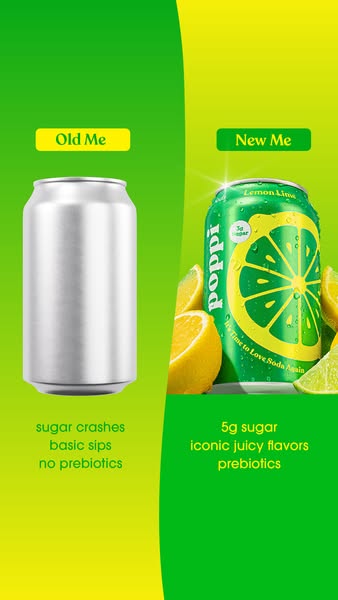
Poppi split comparison ad with Old Me on left showing blank silver can and New Me on right showing vibrant green lemon lime can
Poppi

How Poppi uses a lifestyle before-and-after contrast for healthy soda