
Skip to content
AdVariq
Poppi·Observed October 11, 2026

How Poppi uses a lifestyle before-and-after contrast for healthy soda

Poppi translates the before-and-after framework to beverage marketing. A curving split contrasts the "Old Me" of generic sugar crashes with the "New Me" of prebiotic lemon-lime soda.
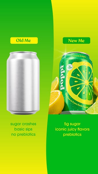
Poppi split comparison ad with Old Me on left showing blank silver can and New Me on right showing vibrant green lemon lime can
Source MaterialMeta Ad Library
Aspect Ratio
338:600
Native Dimensions
338 × 600 px
Third-party advertising reference from Poppi for layout analysis and design education.
Creative Workflow

Use this verified reference as an architectural layout template for your own products in AdVariq.

Use this reference

Continue in AdVariq to supply your product photos and review your ad before generating.

Creative Deconstruction

Visual hierarchy, copy placement, and compositional mechanics observed in this ad.

1

Personal identity framing shifts focus from product to consumer

Observed element: The tags at the top read "Old Me" and "New Me" rather than "Brand X vs Poppi".
Why it works: Framing the contrast around personal habits empowers the consumer, making the switch feel like a self-improvement choice rather than a corporate comparison.
How to adapt: Frame competitive alternatives around the customer’s former habits rather than attacking competitor brand names.
2

S-curve fluid division breaks rigid geometric grids

Observed element: A smooth organic S-curve splits the left lemon-yellow field from the right lime-green field.
Why it works: The fluid division feels lively and dynamic, visually mirroring refreshing liquid movement.
How to adapt: Use flowing curves or wave separators instead of stiff straight vertical lines when advertising liquids or fresh goods.
3

Sensory garnish reinforces flavor freshness

Observed element: The right side features freshly sliced yellow lemons, vibrant lime wedges, and condensation droplets on the can.
Why it works: Real fruit slices establish genuine flavor credentials, making the 5g sugar claim feel naturally delicious.
How to adapt: Surround packaged CPG goods with real raw ingredients to elevate taste perception.
4

Three parallel bullet points make comparison instantaneous

Observed element: Left lists "sugar crashes / basic sips / no prebiotics"; right highlights "5g sugar / iconic juicy flavors / prebiotics".
Why it works: Matching each negative category trait with a direct positive counterpart creates an unmistakable value balance.
How to adapt: Align your feature comparison symmetrically so every stated customer frustration has an immediate answer.

Applicability & Boundaries

When to use this structure

Ideal for health-conscious food, beverage, or lifestyle alternatives that aim to unseat entrenched category habits by appealing to personal wellness identity.

What NOT to copy

Do not copy Poppi’s distinctive typography, proprietary prebiotic blend statements, or branded color combinations.

Adapt this idea

Copy this structured framework into your creative brief or design checklist.

Use this ad as a reference for identity-led comparative contrast.

My product: [name, flavor/variant, and styled packaging]
Former consumer habit ("Old Me"): [3 pain points of current category defaults]
New upgraded habit ("New Me"): [3 corresponding product benefits]
Natural flavor garnish: [fresh fruit or ingredients to accent]

Use an organic dividing curve and matching complementary color blocking.

Questions About This Ad

Can comparison ads use generic unbranded cans?

Yes. Using a generic blank silver can represents the broader category of traditional sugary sodas without triggering trademark disputes.

Why emphasize prebiotics alongside low sugar?

Low sugar explains what is removed; prebiotics explains what positive nutrition is added. Giving consumers both reasons makes the purchase rationale bulletproof.

Categories for this creative:

Related Ad Breakdowns

Explore comparable layout frameworks from other brands in this category.
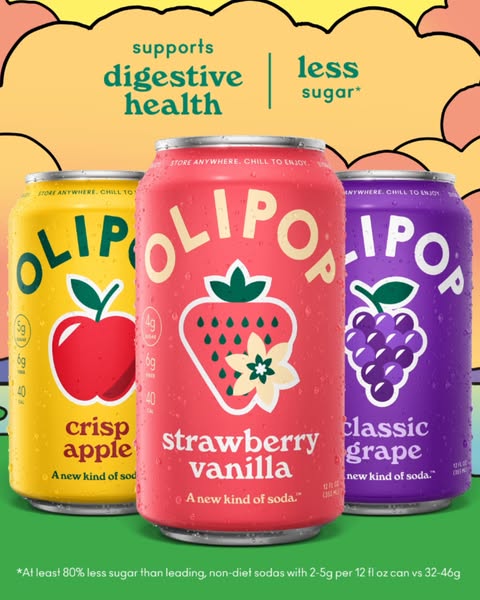
Three cans of Olipop soda arranged on pastel background with digestive health and less sugar headline
Olipop

How Olipop balances appetite appeal and functional benefits in a static lineup

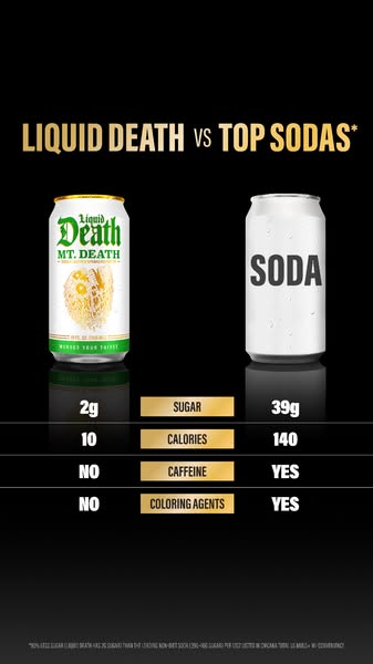
Liquid Death can side by side with generic soda can with four-row nutritional scorecard comparison
Liquid Death

How Liquid Death uses a nutritional scorecard to unseat legacy sodas