Skip to content
AdVariq
Creative Structure

Before and After Static Ad Creative Examples

Before-and-after creative structures organize visual comparisons to communicate change. Whether illustrating advertised skin progression across milestones or contrasting pre-product habits with post-product choices, these ads structure problem-and-solution narratives with clear visual boundaries.

Curated Ad Breakdowns

Curated ad creative references with documented structures and layout hierarchies.

4 Curated References
Chemist At Play1080×1350

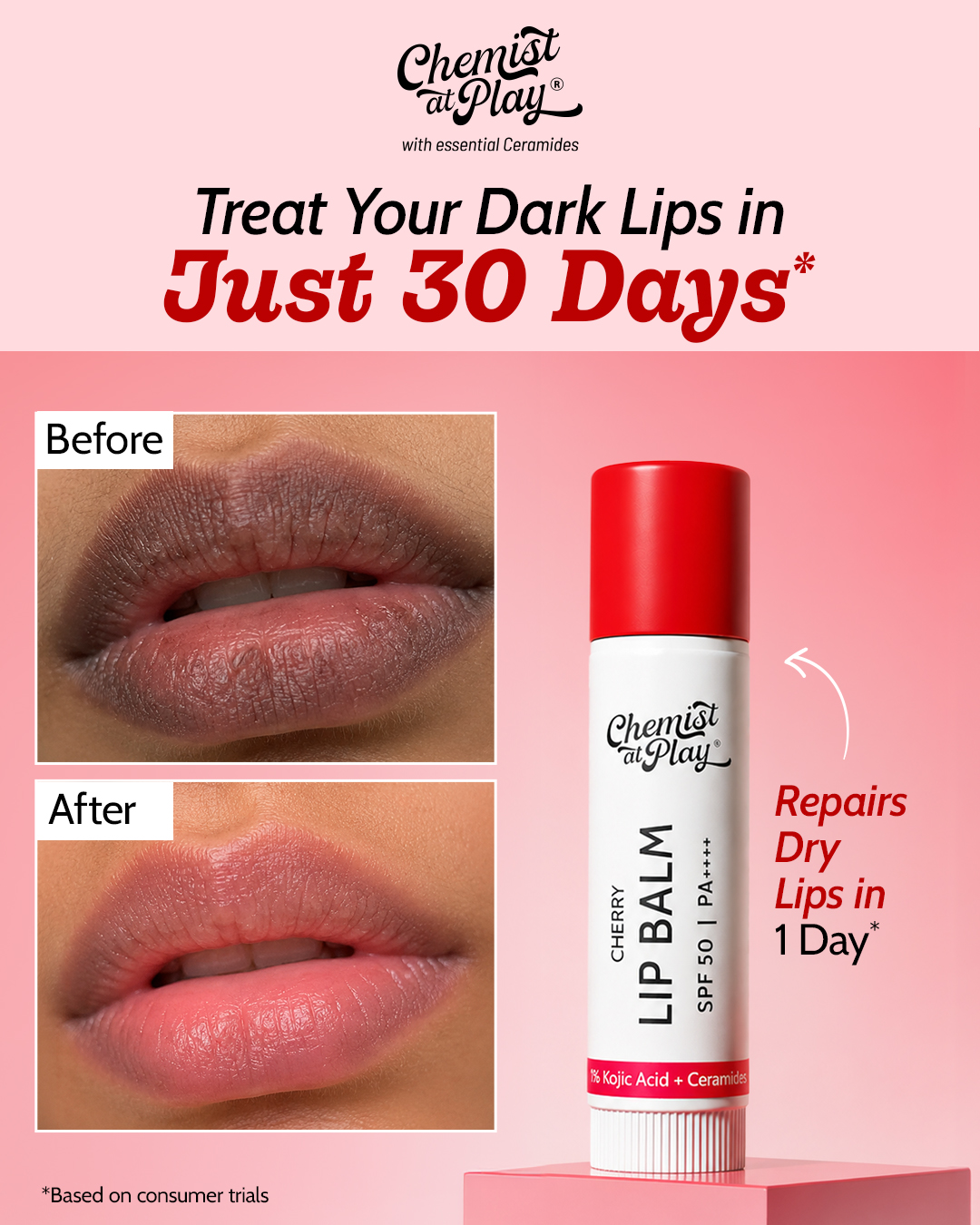
How Chemist At Play structures a before-and-after lip treatment static ad

This 4:5 static ad pairs photographic before-and-after proof on the left with an upright packshot and active ingredient claims on the right, organizing split proof and product specs into a clear two-column layout.
SkinKraft1080×1920

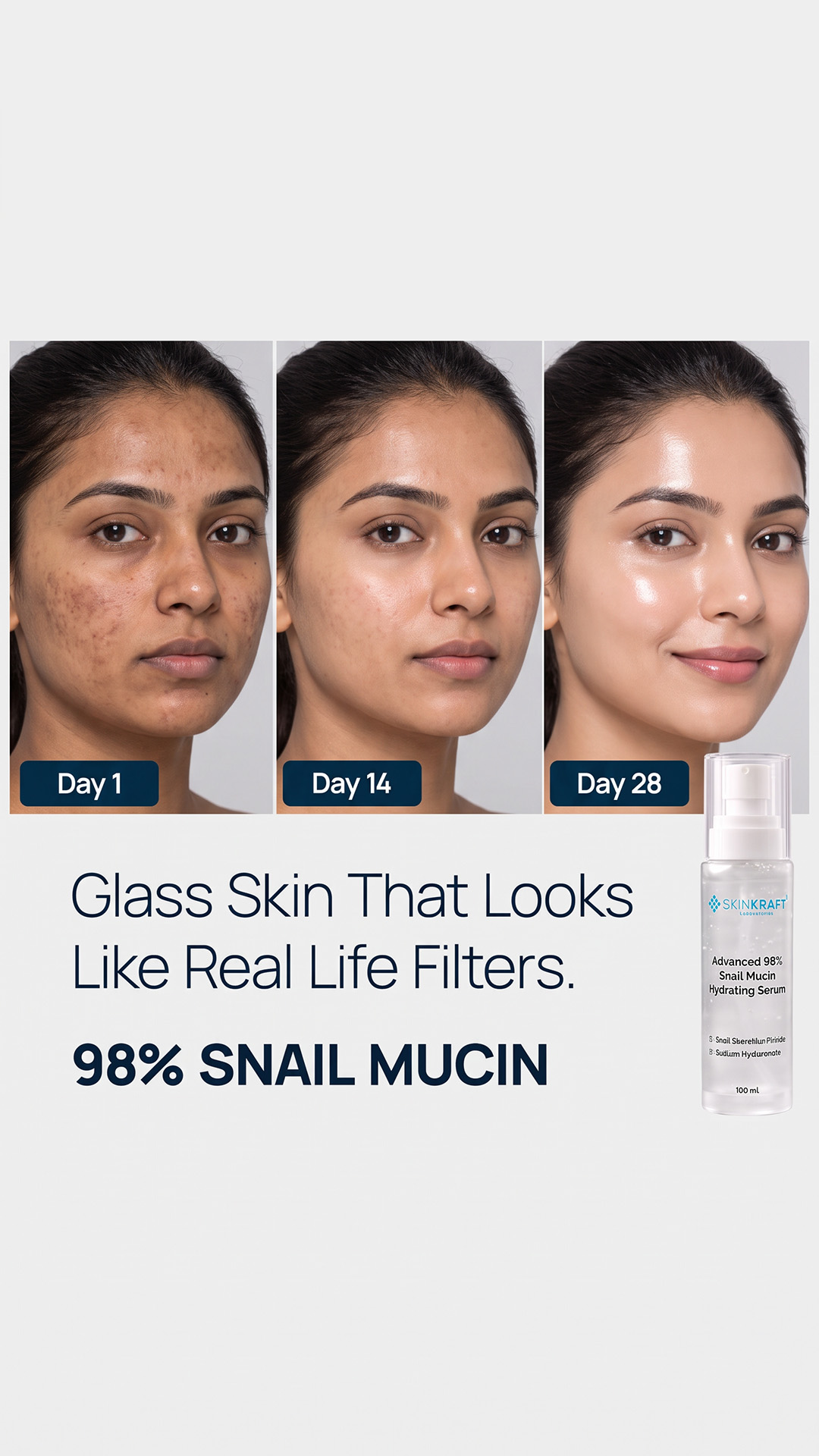
How SkinKraft structures a 3-stage chronological transformation ad

In this vertical ad, the original creative presents an advertised timeline across three panels labeled Day 1, Day 14, and Day 28. Below the progression strip, a conversational headline and prominent 98% snail mucin bottle anchor the layout's information hierarchy.

Poppi338×600

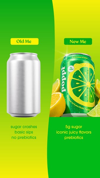
How Poppi uses a lifestyle before-and-after contrast for healthy soda

Poppi translates the before-and-after framework to beverage marketing. A curving split contrasts the "Old Me" of generic sugar crashes with the "New Me" of prebiotic lemon-lime soda.

Dermatouch1152×2048

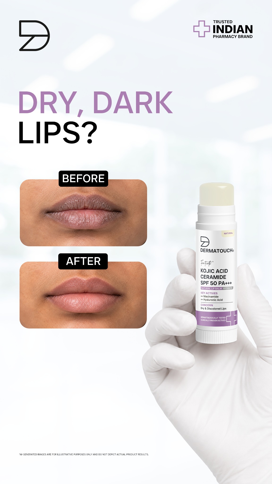
How Dermatouch structures a dual-frame before-and-after lip care ad

This vertical 9:16 static ad presents a split-panel illustrative before-and-after composition. It pairs illustrative comparison panels with centered packshot photography and concise ingredient callouts, carrying an explicit on-image disclaimer that the visual is an AI-generated illustration rather than photographic product proof.

Angle Comparisons & Selection Guidance

Evaluate how different creative structures on this page solve specific messaging challenges.

Chronological 3-stage timeline vs. dual-panel condition contrast

SkinKraft structures an advertised progression across Day 1, Day 14, and Day 28 panels to illustrate claimed milestone changes, whereas Chemist At Play uses two stacked panels for immediate Before vs After comparison.

Dual-panel illustrative mockup vs. consumer identity state contrast

Dermatouch uses stacked comparison panels with an explicit AI-generated illustrative disclaimer to visualize problem and solution states, whereas Poppi contrasts the 'Old Me' of sugary soda with the 'New Me' of gut-healthy prebiotic soda.

Frequently Asked Questions

Practical considerations when planning ads for this creative category.

How do ad platforms regulate before-and-after images?

Meta and Google enforce strict policies against deceptive or exaggerated bodily transformations. Always include realistic lighting, avoid misleading retouching, and disclose test conditions or consumer trial caveats.

Can non-skincare brands use a before-and-after structure?

Yes. Poppi effectively uses an 'Old Me vs New Me' framework for beverages, contrasting daily habits and consumer state rather than anatomical changes.

Explore Related Creative Collections