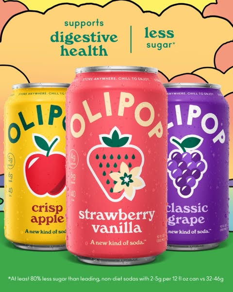
These Facebook static ad examples show eight ways to present a product: a flat-lay, a gift, a welcome kit, a kitchen scene, an offer, a value message, a routine and a size comparison. Each breakdown separates what is visible in the image from the accompanying ad copy and suggests one comparison to try.
About the sources: These third-party images were collected from the public Meta Ad Library on September 30, 2026. Platform and placement fields were not captured, so Facebook Feed placement is unconfirmed. No spend or conversion data was available. These are visual references, not AdVariq outputs, customer results or a ranking of successful ads. Offers and claims belong to the archived ads.
Browse the 8 static ad examples
8 detailed Facebook static ad breakdowns
For background on the difference between creative assets and delivery mechanics, read our foundational guide on what static ads are and how they work.
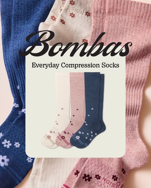
1. Bombas: Product name and benefit headline
- What the image shows
- The artwork shows blue, pink, and white socks arranged around “Everyday Compression Socks.”
- Source ad text
- The source record separately lists ad copy about tired legs and a first-order discount headline; neither appears in this artwork.
- What to test
- Compare this flat-lay with an in-use photograph while keeping the same verified offer and copy.
2. BarkBox: Tangible bonus gift as the visual hero

- What the image shows
- The artwork places a dog inside a purple octopus-shaped bed beneath “Free Ollie the Octopus Bed”; a $49 value callout is also visible.
- Source ad text
- The source ad record describes the free bed as a bonus with a first BarkBox; that condition is ad copy, while the image foregrounds the gift.
- What to test
- Test a gift-led image against a product-and-subscription overview, with the same offer terms stated clearly.
3. Huel: Welcome kit and introductory offer
- What the image shows
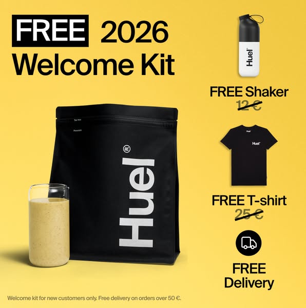
- The yellow artwork presents a “FREE 2026 Welcome Kit” with a Huel pouch, shaker, T-shirt, and free-delivery callout.
- Source ad text
- The visual does not show a prepared meal or a price-per-meal comparison; the offer conditions appear in small print at the bottom.
- What to test
- Keep the included items and eligibility conditions legible when testing a bundle-led offer.
4. Our Place: Kitchen scene and grouped products
- What the image shows
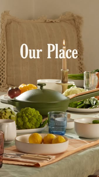
- The photograph shows cookware and tableware arranged with vegetables and food on a kitchen table; no review count or trust badge is visible.
- Source ad text
- The image works through a kitchen-use setting and a grouped product view, without a specification list.
- What to test
- Compare this kitchen-table scene with an isolated cookware view; do not add review or trust claims without separate evidence.
5. PetLab Co.: Offer and review claims in the artwork
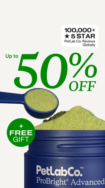
- What the image shows
- The artwork shows the ProBright Advanced jar and powder beside “Up to 50% OFF,” “+ FREE GIFT,” and “100,000+ 5 STAR” review callouts.
- Source ad text
- Those promotional and review statements are visible advertiser claims; the image does not show a veterinary-formulated seal.
- What to test
- Keep price, gift, and review claims tied to the exact offer and evidence available when adapting this layout.
6. Brooklinen: Value line on a bedding image
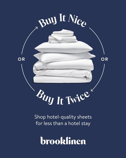
- What the image shows
- The artwork shows a stack of white bedding on a dark blue background with “Buy It Nice / Buy It Twice” and “Shop hotel-quality sheets for less than a hotel stay.”
- Source ad text
- The question about when sheets were last changed appears in the separate Meta ad headline, not in this image.
- What to test
- Test a concise value line against a product-detail headline while keeping the bedding image unchanged.
7. Naturium: Four products under a routine headline
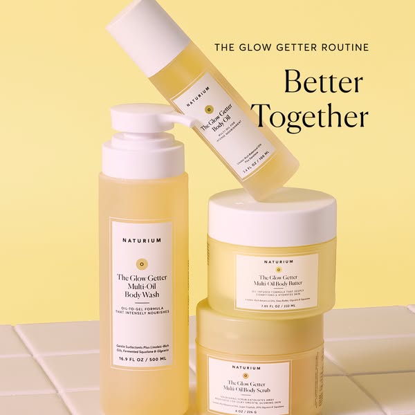
- What the image shows
- The yellow artwork shows four Glow Getter products: an angled body oil bottle, a pump body wash bottle, and two stacked jars of body butter and body scrub, under “The Glow Getter Routine / Better Together.”
- Source ad text
- The source ad text describes a four-step collection. The image groups four products under a shared routine headline.
- What to test
- Test a small product grouping with a short shared headline against a single-product view, without inferring a complete routine from the image.
8. Hydro Flask: Side-by-side scale and line extension
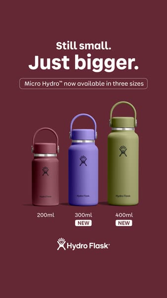
- What the image shows
- The burgundy artwork shows three Micro Hydro bottles labelled 200 ml, 300 ml, and 400 ml, with “Still small. Just bigger.”
- Source ad text
- The source ad text separately says the product line has become roomier; the image itself shows three sizes and no outdoor scene.
- What to test
- A labelled size lineup can clarify a range; verify that units and variants match the product page before using this pattern.
How to choose a static ad structure for Facebook
Choose the structure that answers the shopper’s question and suits the photographs you have:
| Creative framework | Best suited for | Core message job | Key asset requirement |
|---|---|---|---|
| Product Benefit (e.g. Bombas) | Shoppers comparing functional apparel | Pairs a product name with a stated benefit in the source ad copy | Accurate product image and substantiated copy |
| Tangible Bonus Gift (e.g. BarkBox) | Shoppers considering a first subscription | Shows the gift included in an introductory offer | Professional photograph of the bonus reward |
| Welcome Offer (e.g. Huel) | Shoppers considering an introductory offer | Shows the welcome kit and gift items in the artwork | Clear image of included items and offer conditions |
| Kitchen Context (e.g. Our Place) | Shoppers evaluating cookware | Places a grouped product view in a kitchen setting | Scene that clearly shows the products |
| Value Statement (e.g. Brooklinen) | Shoppers comparing bedding | Pairs a short value line with a product image | Clear product grouping and readable message |
| Curated Routine / Bundle (e.g. Naturium) | Shoppers considering a coordinated product range | Presents four products with a concise shared headline | Cohesive multi-product lineup shot |
| Side-by-Side Scale (e.g. Hydro Flask) | Line extensions and existing customer retargeting | Shows labeled capacities side by side | Photograph showing the three labeled product sizes |
4-step checklist: From reference to your own Facebook ad
Adapting these ideas to your ecommerce brand does not require copying another company's aesthetic. Follow this 4-step production checklist:
- Audit your raw photography: Start with clean, high-resolution product photography with neutral or transparent backgrounds. Make sure your hero product is sharp, properly lit, and not distorted.
- Select one single message: Decide whether this creative is solving a problem, highlighting an offer, proving social credibility, or showing how a bundle works. Do not try to pack all four into one image.
- Preview at phone width: Use the intended placement preview on a phone and check that the headline, product details and important conditions remain legible.
- Plan an isolated A/B test: Pair your static creative with a defined hypothesis. Test one variable at a time—for example, compare a question hook against a benefit hook while keeping the product image, discount code, and landing page destination identical.
Create your next ad with AdVariq
Create ads, explore fresh creative angles, and generate variations for your next campaign.
Frequently asked questions
What size should a Facebook static ad be?
Prepare the layout for the placement you intend to use. Square 1:1 and portrait 4:5 are useful starting points for Feed creative; a 9:16 composition needs a separate placement check. Confirm resolution, file type, file size and safe areas in the current Meta Ads Guide and upload preview. The source files above are archive images, not export specifications.
How much text should I put on the image?
Include the message and conditions someone needs to understand the offer. Preview the ad at its actual phone display size. If the headline, price or qualification needs zooming, shorten the copy or change the layout. These examples do not establish a universal word limit or an algorithmic advantage for a particular amount of text.
How many static ad variations should I test per product?
Use the number your budget can give meaningful delivery. Start with distinct questions, such as product-in-use versus a packshot, rather than many background-color changes. Keep the offer and destination consistent. For a controlled comparison, use an appropriate experiment setup; putting several ads in one ad set does not ensure equal delivery. Our static ad testing guide explains what to measure.
Where can I find more real ecommerce ad creative?
Search an advertiser in the public Meta Ad Library, or browse our public ad reference library. Record the source and observation date. An ad appearing in a library does not tell you its CPA, ROAS or whether its offer is still available.
Turn your product photos into static ads
Start with a clear product photo, one supported message and the offer you actually plan to run. In AdVariq, you can use those inputs and your brand assets to generate static image variations in 1:1, 4:5 or 9:16.
Check the result against the source photo, including packaging, labels, proportions and wording. Preview it in the intended placement before use. AdVariq creates the image; publishing, targeting and campaign measurement remain in your advertising platform.
Try the AI Facebook ad generator, compare Instagram image ad references, or use the Stories creative guide for a vertical version.